A friend who tends to do very interesting (and often confidential) research about media just sent me this lovely diagram. Of what, you ask? Your guess is as good as mine.
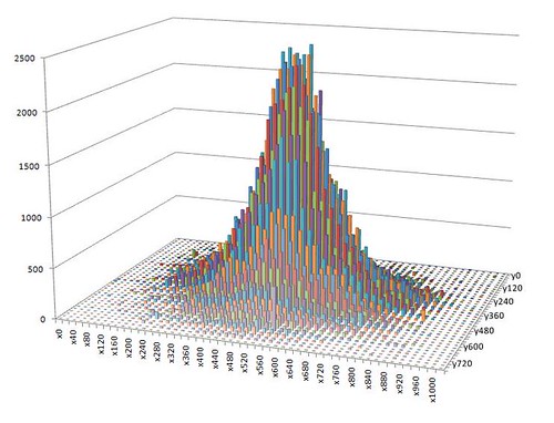
Said friend writes: “That’s a charmingly normal distribution… I love it when, every now and then, data turns out exactly like you want it to… I actually know what’s going on in the data, and what X and Y represent… I just can’t talk about it.”
I’m intrigued.
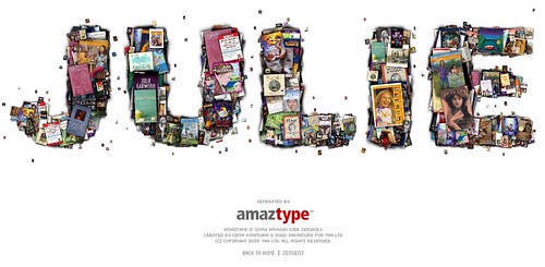
Amaztype uses the amazon.com API to pull search results for a given keyword, then returns results in the shape of the search term. My name returns a lot of different editions of Julie of the Wolves.
(Another great find from Kristin.)
Wordle has been making the rounds lately but I’ve just gotten in to mess around with it — and it’s fabulous.
Here is a Wordle rendering of all of my del.icio.us tags:

Sure, it’s just a tag cloud. But, because the final layout is so well done and the creation interface is so thoughtfully put together, the data can be manipulated and understood in a way that wouldn’t be possible with traditional tag clouds.
Online home of Juliette Melton