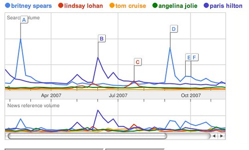
UI on the radio
Wednesday, May 30th, 2007I’m listening to All Things Considered, where they’re doing an admirable job of explaining the new Microsoft Surface. Interesting confluence of very different media.
I’m listening to All Things Considered, where they’re doing an admirable job of explaining the new Microsoft Surface. Interesting confluence of very different media.
The Boston Globe’s team created a great interactive view of the Boston Marathon course.
(Tomorrow’s marathon is going to be grim, with 50 mph winds and heavy rain.)
“Help” is a pretty unhelpful navigation label. What’s even less helpful is if instead of saying “help” you say “H” and then put “help” in tiny letters underneath.

Now, the instructional designer for this online course needs to explain that you need to click “H” to get to “help” which is where you’ll learn “how to use this course.”
Starting the Course
If this is the first time using this course, please click Help (”H” top-right navigation) to learn about how to use this course. If you are familiar with teh course, click the Overview topic in the drop-down menu to begin.When you see “click Next to continue,” in the course topics, please click the Next button (”>”) in the top-right navigation bar.
There’s a lot of extra space in the design. I would change the link text to “Learn how to use this course.” I’d recommend also changing the > to “Next page.” (And then make the “back” button operable; I had to reload the large Flash file to get back to the main page.)
As a rule, if you have to parenthetically explain how to use your navigation, you should reevaluate your navigation design and labels.
Hillary sent this “simple picture of how darn rainy it is in Seattle.” I love the elegance of the design. (In Boston we’ve moved from snow to sleet to pouring rain. Progress…)
originally posted to linoleumjet.com
From Presentation Zen’s review of Daniel Pink’s A Whole New Mind:
To many business people, design is something you spread on the surface, it’s like icing on a cake. It’s nice, but not mission-critical. But this is not design to me, this is more akin to “decoration.” Decoration, for better or worse, is noticeable, for example — sometimes enjoyable, sometimes irritating — but it is unmistakably *there.* However, sometimes the best designs are so well done that “the design” of it is never even noticed consciously by the observer/user, such as the design of a book or signage in an airport (i.e., we take conscious note of the messages which the design helped make utterly clear, but not the color palette, typography, concept, etc.). One thing is for sure, design is not something that’s merely on the surface, superficial and lacking depth. Rather it is something which goes “soul deep.”
“It is easy to dismiss design — to relegate it to mere ornament, the prettifying of places and objects to disguise their banality,” Says Pink. “But that is a serious misunderstanding of what design is and why it matters.” Pink is absolutely right. Design is fundamentally a whole-minded aptitude, or as he says, “utility enhanced by significance.”
From presentationzen.com.