Archives for the information design category


Killface on the essence of information design

Thursday, October 9th, 2008

The ever-observent Killface of Frisky Dingo is displeased that a map is missing some essential information. “Oh, here’s a good idea — indicate north! Otherwise, it’s not technically a map. It’s just a drawing.”

Killface

“A charmingly normal distribution:” Adventures with mystery data

Wednesday, July 30th, 2008

A friend who tends to do very interesting (and often confidential) research about media just sent me this lovely diagram. Of what, you ask? Your guess is as good as mine.

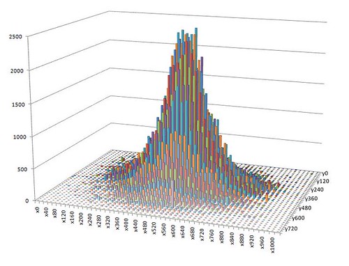
Said friend writes: “That’s a charmingly normal distribution… I love it when, every now and then, data turns out exactly like you want it to… I actually know what’s going on in the data, and what X and Y represent… I just can’t talk about it.”

I’m intrigued.

amaztype: good use of the amazon.com API

Tuesday, July 8th, 2008

Amaztype uses the amazon.com API to pull search results for a given keyword, then returns results in the shape of the search term. My name returns a lot of different editions of Julie of the Wolves.

amaztype - visual search

(Another great find from Kristin.)

Playing with Wordle

Friday, July 4th, 2008

Wordle has been making the rounds lately but I’ve just gotten in to mess around with it — and it’s fabulous.

Here is a Wordle rendering of all of my del.icio.us tags:

Wordle rendering of my del.icio.us tags

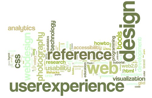
Sure, it’s just a tag cloud. But, because the final layout is so well done and the creation interface is so thoughtfully put together, the data can be manipulated and understood in a way that wouldn’t be possible with traditional tag clouds.

Infographic: Britney’s media impact

Wednesday, January 30th, 2008

Salon.com’s coverage of Britney Spears is great. “We’re only interested in the cultural manifestations of Britney-dom, we swear.” This article points to a Google Trends infographic which embodies the essence of good information display: lots of data pulled together in a way that tells a compelling story.

Google Trends: britney spears, lindsay lohan, tom cruise, angelina jolie, paris hilton

on #themeword

Thursday, January 3rd, 2008

One of the highlights of LifeCamp was the discussion about theme words and what our theme word for 2008 would be. (Mine was “create.”) Chris Messina posted his to twitter, and thus a meme was born. See Chris’s recounting: Kicking off 2008 with a themeword

I wondered if there were any interesting patterns in the #themewords, so did a quick tweetscan search for themeword hashtags, scraped the data, and dumped it into Excel (with some nominal de-duping). I noticed that there were only a few words that were used by multiple people, but that the overall tone was amazingly positive.

I thought this would look interesting as a tag cloud (an overused visualization technique, yes, but still sometimes useful) so looked for and found a nice way to create an on-the-fly tag cloud at tagcrowd.com. The tagcrowd CSS got mangled by the WordPress template CSS, so I did a screen capture and posted the image to flickr.

#themeword tag cloud

Beautiful, eh? Here’s to a happy 2008!

Stop hassling me and just shut down already.

Thursday, November 29th, 2007

Why do I have to answer so many questions when I just want to shut down my laptop and go home?

Textpad: Do you want to save untitled.txt?
Me: No! If I’d wanted to save it, I would have.
Entourage: Do you want to empty your junkmail folder?
Me: I don’t care! Maybe I do, but why do I have to decide right now?
Firefox: You are about to close 10 tabs. Are you sure you want to continue?
Me: Yes! Why else would I be trying to shut down the machine?

Imagine if our houses were like this. (Error: you are about to leave the kitchen without emptying the dishwasher. Cancel | Yes | No ) We would not stand for it.

Why can’t I just turn off the computer? Is it really such a dumb machine that it can’t remember the last version of all open files? I wish I had a switch labeled “just turn off, I mean it, it’s time to go home and I don’t want to deal with you anymore.”

Is netflix.com the new CSS Zen Garden? (Which had been, in turn, the new amazon.com)

Saturday, November 10th, 2007

Another conference/seminar/meeting, another reference to netflix.com.

Many web eons ago, back in 2001 or so, amazon.com was brought up in every conversation of “what a website should look like.” Build tabs! Tabs are neat. They’re like file folders. People understand them. Just keep adding more tabs as you get or define new content areas. If you have more tabs than fit across one row? No problem! Add a second row. And a third. Amazon continued with the tab metaphor to the point where, because of the multiple rows of tabs, the structure became increasingly clumsy. So at some point the amazon.com designers scaled back to one row of tabs and had one of the tabs show, on hover, a big list of all categories. This felt like progress. Recently amazon.com was reborn with no tabs at all. This felt like an important moment in the trajectory of designing for the web.

In any case, my web-oriented discussions in meetings in 2001 focused on “What should a website look like? What is good navigation? What is amazon.com doing, and how can do learn from it?”

Fast forward, sort of, to a couple years later. Thanks to the efforts of Tantek and other smart people, the possibilities for page structuring using CSS were beginning to be understood, and navigation issues took the backseat to convincing Powers That Be that CSS was worth ripping apart and reassembling many thousands (in my case) of HTML documents.

Around this time a showy and fabulous grouping of sites known as csszengarden.com came on the scene. The CSS Zen Garden project was a chance for designers and CSS aficionados to prove to the world that CSS sites could be even more lovely than table layouts. From this point, in every meeting, in every discussion, in every utterance of web strategy-ness there came the inevitable “look at csszengarden.com! Look at what we can do with CSS!”

Somewhere along the way we, the CSS converts, won the battle over tabled layouts. CSS and XHTML are now standard. I’m not sure what role csszengarden.com played in this, but in my experience it was certainly significant in helping convince designers and business managers that CSS could help make stuff beautiful (as well as, of course, more easily maintainable). This started around 2002 and lasted until around 2005.

The discussion, particularly around 2002-03, was centered around “How should we build websites? What can we do with CSS?”

Since that time, web interactions have gotten more complicated and more important than ever for business operations — and the discussion has shifted to be more about ROI and customer experience. My conversations are less about how websites should be built, and more about what they should do.

And now, people bring up netflix.com to me on an almost daily basis, as the site does an exemplary job of explaining a complicated business process at the same time as offering a compelling and easy sign-up process; we are all thinking about the user experience in ways that we weren’t before.

I would say this is progress.

And I would say that the luster of the netflix.com experience will wear off fast. Until you sign up and provide personal information, the experience feels flat and disconnected. I predict that the next “brought up in every meeting” site will provide a rich and contextual experience before the sign up process is completed. (Maybe along the lines of upcoming.org?)

How did you feel about the earthquake?

Tuesday, November 6th, 2007

A week ago the Bay Area experienced a 5.6 magnitude earthquake. Below, part of the USGS “Did you feel it?” earthquake report form:

Your experience of the earthquake:

How would you best describe the ground shaking?

  • No description
  • Not felt
  • Weak
  • Mild
  • Moderate
  • Strong
  • Violent

About how many seconds did the shaking last? []

How would you best describe your reaction?

  • No answer/No
    reaction/Not felt
  • Very little reaction
  • Excitement
  • Somewhat frightened
  • Very frightened
  • Extremely frightened

How did you respond? (Select one)

  • No answer/Don’t remember
  • Took no action
  • Moved to doorway
  • Dropped and covered
  • Ran outside
  • Other

If other, please describe:[]

The Solar Magnitude Forum concept in action

Monday, October 15th, 2007

The Solar Magnitude Forum concept is essentially that a given user will be most interested in topics that are either 1. very closely aligned with her interests or 2. unusually important and interesting.

The idea was initially defined within the context of the asynchronous discussion forum, but it could be extended further.

A couple days ago I came across this example from the Forrester site:
Forrester newsletter options
(larger screen capture)

Forrester is suggesting that I’d be interested in subscribing to newsletters that they assume as being directly applicable to my interests, and also newsletters that they assume I’d be interested in because they are the most widely read or broadly positioned.

The UI is simple and the app does the (relatively) heavy lifting of determining what the user would find the most interesting. The user is saved from paging through a painfully long list of all available newsletters to pick out the ones that are the most useful.