Designers, entrepreneurs, a CTO; on the surface it was a standard kind of SF tech community gathering, held at the posh Designer Fund headquarters in SoMa. People drank coconut water and shared their Twitter handles. But what made this event different was what brought everyone together, and what we created together during that sunny winter afternoon last weekend.
It started when I met Maria a few months ago. We found we shared a background in design research and educational technology and a deep interest in supporting people’s personal and career growth. We knew we wanted to collaborate because we both so deeply believe that the work that we do to make the world better starts with being able to do better work. We do better work when we improve how we stay present, focused, aware, emotionally at-ease, open to others, focused on the right stuff, aligned to a meaningful goal, and energetically balanced.
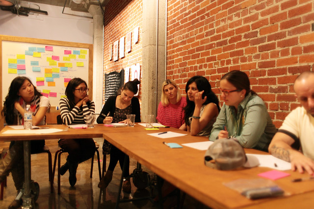
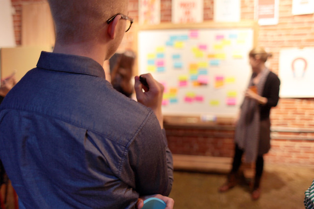
The Post-its started flying the first time we had a brainstorming session to figure out where to start. The place where we kept landing, where we felt that there was so much to say and work on, was procrastination. We started talking to friends about it to assess their interest, and we heard lots of “Oh… yeah. That is really an issue.” We realized the extent to which procrastination is a source of daily stress and suffering and a block to things getting done. And we learned that it’s a topic that people often feel uncomfortable talking about at work. We’d found our first topic, and leading a workshop about it seemed like a great place to start.
I love designing workshops for IDEO. I love how people can come together, and how a really well-designed workshop experience can transport people to a new understanding of themselves and their work. I was excited to bring that same level of workshop design to my community in San Francisco.
We called the workshop “Procrastination and the Fine Art of Getting Shit Done” to be a little cheeky. (Pro tip: give your event a compelling name and people will sign up out of the blue.)
The workshop was really wonderful. Through careful facilitation, we helped people get to know each other and share stories of when they’ve been stuck; we explored what procrastination means to each of us; and we did an IDEO-style brainstorm around why we procrastinate. We did a writing exercise around our feelings about procrastination, and looked at the language that we use to talk about it. We surfaced emotion, normalized a taboo experience, showed people the way in which they deal with this, and reflected on how to do it differently.
During the second part of the day we discussed strategies around planning, habits, and reframes, sharing the best that we’ve learned from wide research and experimentation. I loved distilling down and sharing the wisdom that we learned from so many places. Two tactics that the group really appreciated were the Tiny List (keep your to-do list limited and start a new one every day) and the Don’t List (be clear with yourself about what just isn’t going to happen). Maria dove deep into the workshop content in her article What You Must Know About Your Procrastination.
At the end of the workshop, the group wanted to help each other move forward together, and we’re going to check in with each other in a month to see how folks are adapting new strategies and approaches. Maria and I learned how much we enjoyed working together, and we’re busy collecting feedback and designing our next workshop. We’re looking forward to helping more people do better work in the world.
(Photos courtesy Jesse Chan-Norris.)